FMP — Human Being; or, How To Be Remembered
Posted: May 12, 2017 Filed under: Field, Field - Year 3 Leave a commentWe’ll all be forgotten when the world ends.
It’s finally here! The finally final major final project of the final year of my degree. I wish I could say I was ready for it, but I don’t know who would be, to be honest.
As much pressure as I could put on myself, though, I realise that this final piece isn’t necessarily my magnum opus, the needlepoint by which I sew my legacy into the fabric of time (haha). It’s just the next step on my always-continuing journey to my eventual demise (unless my plan for immortality works). All I can hope for is something better and more competent than anything I would have produced at the beginning of the course. At least that means I’ve learned something.
It’s also an opportunity to express a more realised version of my personality and voice as a designer, just in time to venture out into the real world.
With that in mind, I knew that I wanted to do something both incorporating photography somehow, and communicating a positive, wholesome message. As I mentioned in my Curiosity blog post, I’ve increasingly held the belief that we should not only accept out imperfections and individual quirks, but embrace them.
My initial idea of producing a photo essay of portraits exhibiting typically unwanted expressions (i.e. blinking, yawning, eating, etc.) went down rather well with Ian in the first tutorial, so I felt confident to carry on exploring that particular subject.
We were asked to submit our own creative brief for our chosen topic quite early on, so it felt good to be able to get my ideas down so quickly and be able to get to working straight away.

I experimented with a few different techniques for capturing subjects. One was to have a slow shutter-speed and capture the range of motion of a person during that period of time, but I felt as though it contained too little detail to be quite as effective as I would like for this particular project.


I conducted a little more research, and remembered a particular chapter from John Berger‘s Ways of Seeing that I really liked. In it, he mentions that wealthy people who commissioned portraits of themselves often used the opportunity to document all the great riches that they owned, because they knew that these paintings would likely extend past their own lifetime. The best way to realistically depict a subject at the time was through oil paint, which of course required a painter, skilled enough to produce work satisfactory enough for the noblemen and women, and so not many people could afford the time or money required to pay for a lot of works throughout their lifetime. They had to squeeze as much into each piece as possible.
“Oil painting did to appearances what capital did to social relations. It reduced everything to the equality of objects. Everything became exchangeable because everything became a commodity.” – John Berger
In lieu of oil paintings, we now have photography — a marvellous, now ubiquitous medium by which we document ourselves and each other every day. However, it seems to me that there are still a few practices left over from those early days which affect our mindset around photography today.
For one, compared to the era of oil paintings or even the early days of photography, we no longer have to hold still for any substantial amount of time for a picture to be made of us, and yet we still feel compelled to pose ourselves whenever we feel a lens pointed at our faces. Posing was required back then, but now we are free to move and express more of our true selves. Humans like to move, so why shouldn’t they be documented moving?
For two, despite it being easier than ever to capture a hundred images within even a minute and discard the unsatisfactory shots if we need to, many of us tense up and stress out in front of a camera as if we must look composed and presentable in each and every shot. The camera seems an almost magical device because of the power it holds, but it is still under our own control, and I personally feel that we let it control us more than we should.
For three, even though we are now able to record such a wide gamut of scenes and situations with our cameras, we still continuously look for that one singular image that represents us entirely, and deem the rest unworthy. It’s silly when you think about it, because none of us are perfect and not only are we all prone to change, but we do change constantly. It would be unreasonable to expect a single photograph to represent an entire person!

I then thought about ways I could address this dichotomy, and decided to incorporate the traditionally regal colours purple and gold somehow. I bought a roll of purple paper to use as a backdrop for my photos, which would also have the added benefit of helping the images stand out in a unified way. At the same time, I concluded that I definitely wanted my images to be in full colour rather than black & white because I needed to display as much humanity as I could, and real life is in colour after all.

I proceeded to produce some test images using myself as the subject, working on framing, colour balance, lighting, and exposure.

At this point, I was still reaching for intentionally ‘bad’ photos to completely counteract the traditional ideal of a ‘good’ portrait, but I was struggling a little with achieving these ‘bad’ moments naturally and with a willing subject. More on that later.
I also looked at the renowned photographer, Steve McCurry, whose phenomenal book, Portraits, delivers a fantastic insight into what photography can do in communicating the emotions of the subject.

And on the subject of emotions, I also read Paul Ekman’s Emotions Revealed, in which he talks about the universal nature of expressing human emotions and his great study on micro-expressions (the process of betraying our true emotions through milliseconds-long muscle reflexes). It was a very interesting read, but a little too in-depth for what I needed to use for my project.

I was also once again inspired a lot by Dallas Clayton and work by similar artists because I wanted to keep my work fairly light-hearted and loving.
As for the presentation of my work, at this time, I was looking into producing a magazine of sorts to display full-page photographs. I thought perhaps the ability to print the photos in a keepsake would reinforce the idea that these ‘bad’ photos are more valuable than the countless digital posed ones all over the internet, and if I could sell these magazines, it might give reason for people to appreciate them more. However, after thinking about this for a long while, I realised that this method was just too convoluted — might hiding the photographs in a book lessen their impact or general perception of importance? And if I’m selling multiple copies, wouldn’t that effectively cheapen their overall value? Also, would it not be a little bit boring?

Thus, I decided to scrap the magazine idea, although it could have made me a bit of money (such a shame!). Instead, I thought about other options, such as a high-quality photo album (more along the right lines of suggesting the sentimental significance of the photos, but high-quality bespoke photo albums are expensive and once again I would be hiding the photos away in a book) and a handmade box of photographs with perhaps a handwritten note to go with it (similar problems here too).
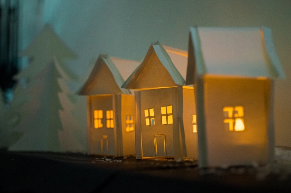
Eventually, after discussing it with a few different people, I settled on the idea of displaying the photographs in nice, ornate, gold frames on a wall. With this, I would be able to suggest the sentimental value of each photograph (like pictures of family members!) while keeping them all completely visible.
The next problem I faced was the fact that I’m studying on a graphic design course and I have yet to do much graphic design in this project… So, again, I spoke to a few different people to get their opinions on how to approach it, and, after a while, landed on the idea of producing examples of what my portraits would look like if they replaced typically serious or professional portraits, such as passport photos or author biographies.

Throughout this process, I’d also been trying to find people to photograph. At first, I expected to need an almost overwhelming number of subjects, but after a while I realised that having ~20-25 different people would be ideal, because it would mean that there would be few enough to not be overstimulating to the audience or to make each individual photograph less significant, but a large enough number so as to achieve a fairly wide variety of subjects and expressions.
Also, along the way, the focus of the photographs had evolved subtly. Moving from simply ‘bad’ or ‘ugly’ photographs, I had learned through photographing each person that a lot of us are more animated and comfortable when engaged in a conversation. When we are caught up in a story or telling a joke, we lose sight, at least just a little bit, of how we are coming across to the other person, and we stop worrying so much about our appearance on camera. I found that a lot of the best, most natural photographs happened when people let their guard down during a conversation. The upside of shifting my focus from simply ‘bad’ photographs to natural candids exposing the movement of a person during a conversation was that a lot more people were willing to sit as subjects! (BONUS!)
After finally completing the photographing-process, I realised, and as it was pointed out to me, that the photographs themselves might not be quite enough to convey my message to the audience. This was a rather sad realisation to me, because I had originally hoped that the photographs could stand alone and communicate what I needed to say on their own, but at least I had realised it at some point, rather than having a frustrated and confused audience on the opening night of the exhibition!
I decided that, since I was already planning to display a few examples of printed media that would typically contain text, I could write a mission statement/essay/manifesto and spread it out across each object, which would also ensure that the audience would spend the time to appreciate each individual piece.
The next thing was to actually write the damned thing. Firstly, I intended to write a formal statement, addressing my key points in a very straightforward, serious manner, but eventually I realised that I didn’t actually have to do that! I could be colloquial and loose and maybe even funny if I played my cards right! Right then, I became a lot more excited about it, and gradually formed some kind of piece involving a form of positive nihilism, which is an approach that I enjoy taking in many situations. Besides, being able to have fun writing it, I felt the piece actually fit a lot better alongside the personality of the rest of my project, if not enhanced it.
In the structure of the writing, I tried to use quite a lot of repetition in order to enforce the idea that the text from each printed object is related to the rest, and they are meant to be read together.
Here’s the text in full:
When the world ends, everything will be forgotten.
In the meantime, however, it’s quite nice to be able to look back through old photographs and relive fond memories.
When the world ends, there will be no more photographs; no more cherished memories to peruse fondly.
Before there were photographs, there were paintings.
Painters used to paint portraits of people who had a lot of money. It used to take ages. They used to charge more for purple. And gold.
Today, purple isn’t so expensive. All the colours are cheaper now. Now we can each have as many pictures of ourselves as we want, and sometimes more than that. But if it’s all so easy, then why are we so bad at it?
There certainly won’t be any photographs left when the world ends. No, they’ll be long-gone. Burnt to ash by the Sun’s fiery curse.
We’ll all be forgotten when the world ends.
The world probably won’t end for a long time, of course, but who knows? We’d best enjoy what we have while we have it. Why bother wasting precious time posing for a camera? Since when is a posed-you the real-you, anyway? You’ll probably have more fun in the long run if you’re just you.
When that big yellow ball melts all our ice, we’ll all be too sweaty to have fun anymore.
Why do we worry so much about how a camera looks at us, and why do we try so hard to exhibit that “perfect” depiction of ourselves? How long has a single person ever stayed still? Motion is an integral part of life, and it’s vital to remember that. No-one’s going to be cherishing their passport photo.
When we’re having a good conversation with someone, we stop thinking so much about what we look like. If we can relax and let ourselves feel emotions, we’ll all be better for it. It’ll make for a nicer picture, too.
How do you want to be remembered? Is it through artificial approximations of humanity, able to be reproduced countless times; or is it through actual unique examples of your personal emotions?
How disappointed would you be if there were no way to remind yourself of what you used to really look like?
We’re always worrying about how we are being perceived by everyone else, but if we worry about it so much that we don’t allow ourselves to be unique, then we lose what makes life so interesting in the first place.
When our star’s eventual death engulfs the planet, there’s not going to be anything left to worry about anyway.
If we show our vulnerabilities just a little bit, we’ll be able to understand each other better, and maybe then we’ll stop being so awkward and defensive around each other all the time. Have some fun.
When the warm sphere gobbles us up and nothing matters anymore, we’ll be sorry we took everything so seriously.
Love from
Eliot
As for the print designs themselves, I spent a while working on the typography, but ultimately used photographs of myself as the focal points of each piece (I felt that using myself would be the best option because it’s all my own text, and using anyone else might place unnecessary significance on that individual person).


Now that all of that was done, the final step was to set up my exhibition space!


In order for it to become what I wanted it to be like for the audience, I had to spend a few hours painting metallic gold onto ~20 frames of different sizes and designs, and I also had to locate a nice wooden table in order for the space to feel like or at least suggest a scene from someone’s home. Thankfully, I was able to find a fairly cheap, high-quality table (which I will be taking home at the end of this, thank you very much!) and hang the frames on the wall in time, and now the whole thing is done! Wow! Yeah, I guess this is the end of the blog post! Finally!


I thought it might be interesting to note that I ended up taking A LOT of photos overall…

Over 3,800 actually. I realise now that I was very lucky that I didn’t run out of space on my hard drive.
This project turned out to be a lot of fun for me!!! I got to improve my photography a lot, especially with actual people, and I’ve struggled with that for a long time. I was also extremely happy with the fact that I was able to communicate my opinions and my ethos as a person/designer to a wider audience.
I’m very happy with my final outcomes as well. That might change, given enough time. Actually, I hope it does change, because I’m still expecting to grow and mature as an artist/designer/human from now and for the rest of my life. That given, I really am please with what I was able to achieve, and it’s great to have this be the final project I undertake for my degree because it means that I have the motivation to keep going and keep learning more!
While I’m here, I might as well write down how thankful I am to everyone I’ve been surrounded by throughout this experience. All of you (yes you!) should have complete confidence that you have made a positive impact on my life, and I hope I was able to do some of the same.
Love from
Eliot
The Big Idea: Curiosity
Posted: May 12, 2017 Filed under: Subject, Subject - Year 3 Leave a commentAt the beginning of this project, we learned that Ray had retired from CSAD! 😦
It’s sad news, but nice to know he’s taking time out for himself now.
Anyway, The Big Idea was supposedly an exercise in idea generation. According to Ian, “Idea generation is a cornerstone of graphic design. The audience will know if your idea has no substance.”
We were given a large list of words and concepts. From there we’d choose one and simply create an outcome inspired by it. Very open-ended, but hopefully it wouldn’t lead to as much paralysis as the ISTD brief…
From the list, I was drawn to the word Curiosity much more than any of the others. I’m not entirely sure why, but I think that, being a very curious person myself, it resonated with me and I felt as though I might be able to bring something interesting to it.
Some suggested questions to ask ourselves to begin the project were:
- Is there a group collective understanding of the term in question?
- What does it mean?
- Is it a term of current common usage?
- Is there a particular context in which it is heard?
- Is there a particular situation to which it relates?
- Do you have preconceived ideas about the term?
- Is it a topic that generates an emotional response?
After the briefing, I left feeling particularly inspired and eager to start working. In fact, the moment I started walking home, I had the idea of what I wanted to produce in my head already and began writing it on my phone to make sure I didn’t lose it.
My initial research led me to the dictionary definition of the word ‘curiosity’, which has two meanings. One, obviously, being a desire to know or learn something, but the other definition (an unusual or interesting object or fact) got me thinking. I really liked that cyclical idea that an unusual object can lead to a desire to know more about it — curiosity inspires curiosity!
I then thought about times in our lives when we engage in curiosity, and came up with four stages, which, in my eyes, are ordered chronologically:
- Childhood
- As children, we are encouraged to be curious and ask questions. Literature geared towards us teaches us that it’s an important part of growing up.
- Cats
- Soon afterwards, we learn the adage, “curiosity killed the cat”. We are told that asking too many question can sometimes be a bad thing, and that it can be dangerous to pry into other people’s affairs.
- Philosophy
- Next, we learn a more ‘sophisticated’ form of curiosity. We learn that intelligent curiosity is a noble cause. The Greek, Philosophia means ‘love of wisdom’.
- Space
- Finally, there is the human desire to reach beyond ourselves physically and explore the unknown beyond our own planet. It’s an inspiration and perhaps a lesson that our appetite for enlightenment should never be sated. Also, the Mars rover is called Curiosity.
One artist I have been appreciating a lot recently is Dallas Clayton, whose illustrations wholly embrace a sincere, childlike appreciation for all the little things in the world. It’s all very positive and fluid and fun, and — at least personally — it makes you take a step back, relax, and agree with him for just a minute.

For quite some time now, I’ve noticed that people take things far too seriously, and they take being wrong as something to be hidden or ashamed of. I believe that, if we could admit to, explore, or even share our faults, then we would all be able to work better together and raise the universal standard of education and wellbeing.

In this project, I saw the opportunity to highlight this problem and encourage people to try to overcome it consciously. My idea was to create a pocket-sized booklet for people to keep around them if they need to be reminded to take a step back and relax a little bit. It would be written vaguely in the style of a children’s book, but with some adult themes and a bit of sly humour to give it an older appeal. It would focus on the kinds of simple, inane questions that children ask all the time, but that we grow out of later in life (sometimes because we know the answer, but also sometimes because we’ve lost that eager curiosity that we once had). I’m arguing that part of the greatness of life is the simple act of being curious itself, and we don’t always necessarily need to know the answer. It’s fun to imagine.
So, seeing as I’d written most of the work so early, I now had time to focus on the visuals to go with it. I did initially intend to use drawn illustrations, but later changed to photographs with a few added illustrative flourishes because I didn’t want the book to seem too childish. I couldn’t find many children’s books with photography-based illustration, so I reasoned that it might make it stand out a little more as a legitimate argument.
I had to spend a few days travelling around in order to get the photographs that I wanted, but it proved to be a fairly manageable task, and I was able to get everything done within a decent amount of time. The next step was to put it all together with the text.
It really is quite strange how much of this project I had in my head so early-on, especially in comparison to the ISTD brief. Even the typeface I used in the final design (Gotham Rounded) was what I pictured right at the beginning.


Overall, I’m very happy with the end results. It’s not the most ambitious piece I’ve done, and I could have perhaps spent a little more time researching a wider range of influences before cementing my final idea, but it felt great to put my argument down on something like this, and I think it’s worthwhile.
Penguin Random House Design Award 2017
Posted: May 12, 2017 Filed under: Subject, Subject - Year 3 Leave a commentI was very much excited for this year’s book cover design competitions. Not that I particularly love the competition aspect, but I was looking forward to reading and interpreting some stories into images.
The options for 2017 were Harper Lee‘s To Kill A Mockingbird, Truman Capote‘s In Cold Blood, and Sue Townsend‘s The Secret Diary of Adrian Mole, Aged 13¾.
We were discouraged from working on To Kill A Mockingbird, presumably because it’s already such a popular book, and it’s already gone through so many redesigns in its lifetime. I wasn’t too broken up over this because I wanted to try reading something new anyway. In fact, I wanted to try reading and designing two books this time, so I went and bought them both straight away.
I read through In Cold Blood first because I knew it would take the longest to complete. The book had a lot of interesting ideas and themes, and I had a few things running through my head as I was making my way across the pages, which I felt was a step in the right direction after the previous project.
I completed Adrian Mole in just a few hours after that, which, yes, is a brag, because I’m very proud of myself. Where’s my gold star?
In Cold Blood
For the Capote cover, I initially focused on typography — writing the title out a few different ways, and analysing the shapes of the letters to try to find a connection between them and the key images of the story. One part of the book I very much liked was the inclusion of the dog who becomes instantly timid and afraid at the sight of a gun, so I tried to draw that a few times, but found I couldn’t quite get the feel right or link it enough to other themes from the story.

The next idea I had was to use an image of a blindfolded person to represent Lady Justice, a big symbol in the American court system. The book itself is a powerful comment on American ideals of justice, and my own copy had a quote on it from Spectator‘s Tony Tanner, describing it as “The American dream turning into the American Nightmare … a remarkable book”. I liked the idea that the blindfold could also suggest the surprise by which everyone was caught by the gruesome murder — no-one saw it coming.
I wrote the title IN COLD BLOOD in blue on a piece of white cloth, and photographed my friend wearing it with red lipstick. I thought the combination of the colours (red white and blue) would further reinforce the link to American culture and pride.
I spent a little while editing the photo, enhancing certain colours, etc, and brought it into photoshop to mock up lots of compositions.
I initially used Courier for the copy to try and evoke images of a police report, but I found that it mostly just made the whole thing feel a little underdesigned. I knew I wanted to go with something bold and powerful to match the punchiness of the story, so I played around for while with arranging the three colours, and eventually settled on something that (hopefully) mimics the American flag — perhaps a form of ironic patriotism.

The Secret Diary of Adrian Mole, Aged 13¾
I was happy to still have time to attempt the second cover, however, I felt a little less inspired by its story. I enjoyed the book, but I knew that I would struggle to do something very different from existing children’s ‘diary’ books. I also felt oddly annoyed by how abrupt and unsatisfying the ending seemed… I suppose I should have realised earlier that it was just the first book in a series.
The first thing I did was attempt to write out the copy in the style of a 13-year-old-boy, but quickly realised how cliché it would be.
I then spoke to a few people to help me pin down the main themes of the book. I liked the idea that Adrian Mole thought himself an intellectual and better than everyone else, because it is unique to his character, so I went with that.
I put together a mockup of a book that looks like high-quality, embossed leather on the front, with cheap card on the back. With this I wanted to illustrate the mature, intellectual, high-class façade that Adrian puts up, despite his still very much working-class upbringing and general lack of idea about anything that’s going on around him.
I was happy with the direction, because it felt fun and a little different from a lot of children’s books of its kind, and I think it’s a theme that not many other designs had chosen to focus on quite so much.
I replaced all of the images with my own, added handwritten text, and eventually finessed the composition into something I am quite happy with.


I very much enjoyed this project. Not because I think it’s my best work, but because I find something really exciting about translating and condensing an entire story into a single enticing image. I would definitely like to do more in the future!
Competitions: ISTD – The Dead Wood Archive
Posted: May 12, 2017 Filed under: Subject, Subject - Year 3 Leave a commentI love to compete and win at games. It’s not so fun when I don’t.
This project was another live brief of sorts. We were told to select a competition to enter from a list of options spread over four different companies: D&AD, RSA, ISTD, and YCN.
On the day the project was given to us, we were shown a few examples of students’ work from previous years for inspiration, and then we were on our way. We were only given the weekend to select a brief and come up with initial ideas, and this is where I first ran into problems.
For some reason, none of the briefs I read through struck me as particularly interesting. At the beginning, I liked the idea of doing a project for a large company like BBC or Amazon, but the briefs themselves didn’t much appeal to me, so I eventually decided to try to push myself out of my comfort zone.
Typography isn’t exactly my forte. I do appreciate it, but I’m not as confident working with it as I am in other things. Therefore, as a challenge, I decided to choose a brief from ISTD and hopefully improve my typography. I chose a brief called The Dead Wood Archive, which entailed going to a library, using a Dewey number made from my birthday to find a book, and celebrate said book. That’s it. It seemed oddly open-ended for a competition, but I figured that might work to my advantage, as I often digress from set briefs anyway.
It did not work to my advantage, but that comes later.
First of all, after working out my Dewey classification number, I realised that I would be looking for a book based on Psychology or Philosophy. This was exciting to me because my father has written some books on philosophy, so I hoped that he might be able to help me gain an interesting perspective or maybe even a leg-up on the competition (who knows, maybe I would even be working on one of his own books for the project?!).
I went to Cardiff Central Library to find the book with the corresponding Dewey number closest to my own, and discovered that I would be reading Philosophy for Life: and Other Dangerous Situations, by Jules Evans. After going through the prologue and introduction in a coffee shop, it seemed the book was in a rather colloquial tone, and the author came across as quite a friendly, down-to-earth chap, which gave me some courage and a sense of optimism for ‘celebrating’ the piece. I decided to begin a new, pocket-sized sketchbook for this project because I also wanted to work on my fluidity in expressing ideas. I’d use this sketchbook as a free-flowing diary which would hopefully allow me to learn to get less caught-up in my own head and all tense inside.

I spent the next day-or-so reading the rest of the book, and it was quite nice that I was able to do that, because I’m generally a profoundly slow reader who finds it difficult to focus on a piece of text for an extended period of time.
Now this is where I really began to run into trouble. Despite constantly making marks, writing, and drawing, I found myself increasingly stuck for ideas. What I normally do when I run into a bad creative block is take a step back for a while and come at it from a different angle a little while later (i.e. procrastinate), but not even that worked! I tried reading around the subject, and looking for interviews and videos of the author in an attempt to glean a sense of his personality as a person and a writer, but that still didn’t unstick me from the mud.
Unfortunately, I had to just take a break from it all. The state of the project was depressing/stressing me, and I’d been going through a bit of emotional stress at the time outside of university, as well as a general lack of sleep, which probably didn’t help.
After struggling with it for a while, I had a chat with Ray Nicklin, who helped me relax a little bit, and suggested that I might be putting a little too much pressure on myself because of my own expectation to produce a worthwhile philosophy-based piece while also forcing the idea of creating something creative and different for the competition.
Eventually, I came back to it with a kind of defiant motivation. There had been a few small ideas floating around my head for a few weeks that I was able to scribble down so finally having something I could at least use felt nice.


There were two ideas from my sketchbook that I saw potential in pursuing. One was from a series of drawing of philosophers done in a loose, almost crude style — suggesting a more personable quality to these great pioneers.
The other was the notion of incorporating a wordsearch into my designs. A wordsearch would obviously communicate the parallel idea of ‘searching for meaning’ in philosophy, but also suggest a more fun, lighthearted aspect of the pursuit of knowledge. Wordsearches are generally easy to pick up and put down, which might also relate to the accessible, casual, easy-to-read tone of the book.
I decided to go with this second idea because I felt that it had the most layers in it as it was, and I was running out of time by this point.
By the end of the project, I had a book cover design to rebrand it and an example of a poster advertisement design to go with it. To be honest, they weren’t the outcomes I had ambitions for at the beginning. I had, of course, wanted to do well in the competition and produce something I could be very proud of, but with the trouble I experience throughout the project, these were all that I had time for.


Don’t get me wrong, I’m still happy with the outcomes as they are, and I think they work well for what they do, but I feel as though I could/should have been more ambitious, or produced something different to what you would normally expect from a brief like this.
Ah well, I guess it’s another valuable learning experience, with a nice bit of irony in experiencing terrible creative block after trying to be more loose with sketching my ideas as the cherry on top.
Real World
Posted: February 2, 2017 Filed under: Subject, Subject - Year 3 Leave a commentFirst project of the year! Ohhhhh boy I love groupwork!
That’s not all sarcasm either; even though it can mean a lot of compromises or creative differences or just plain arduousness, I think learning to work with others and feedback each others’ ideas is extremely valuable experience.
This project was for the Healthy University branch of Cardiff Met, and groups of students were given specific problems to tackle in improving the company’s effect on campus.
In my group were Cara Morris, Shakia Thomas, Natasha Seaward, and Dom Starling; and we were given the topic Welsh Culture: Staff.
I was actually happy to have received this project because I had jus started trying to relearn and improve my Primary-School Welsh, so thought I might be able to bring a bit of insight into the education process with it so fresh in my mind. My decision to voluntarily bring Welsh back into my life after readily dismissing it for so many years came from the realisation that the language is so sadly underrepresented throughout the country, and I wanted to do my bit to change that (apparently only 20% of people in Wales speak Welsh!).
After discussing the project and writing a creative brief with Daniel Tiplady from the Welsh Language section of Healthy University, our main campaign goals became:
- Raise awareness of bilingualism in the university
- Promote synergy between Welsh and non-Welsh speakers
Our target audience was Staff, but in particular we wanted to focus on:
- People who may not have any experience in languages other than their mother tongue.
- People who are perhaps unaware of the difficulties faced by bilinguals.
Furthermore, we needed to show that Cardiff Met respects and encourages an inclusive bilingual environment.
To help us out with this project, we were given the opportunity to make acquaintance with Chessie Gordon-Band, an industry professional who currently works at BrandSixtyEight. In utilising her help, we could perhaps gain a more grounded, fresh, professional perspective on the graphic design aspect of the project.
Chessie is a CSAD alumnus, and I had met her before, though only briefly, so I was looking forward to working with her and learning more about how she’d got on since graduating.
From the creative brief, we worked on some initial ideas for the direction we’d like to go in and quickly came to the conclusion that we should do something fun and lighthearted to get people interested in the language without putting too much pressure on them.
Shakia and Dom aren’t from Wales, so we spoke to them for a little while about what they thought of the language, what interested them about it, and what kept them from learning it. One of the key problems was the sounds of the language — letters like ‘ll’ and ‘ch’ are extremely foreign to English-speakers, and that seems to intimidate newcomers. However, they did apparently find it fun to learn individual words and phrases that would be potentially useful, especially if they sound funny.
From this, we chose a few Welsh words like ‘pilipala’ (butterfly) and ‘popty ping’ (microwave), and thought of ways in which we could use them to pique people’s interest and encourage them to pay more attention to it — including a pressure sensitive sticker that sounds the word when stepped-on (fun!).
In a later tutorial, it was pointed out to us that empathy should be a key aspect in reaching our target audience, and that we should actively seek out people’s opinions — never presume! Our creative focus must also be achievable and have its own place amongst what’s already out there. What currently exists, and what isn’t working about it?
Therefore, the next step was to write a questionnaire with which to ask members of staff, and attempt to gain new insights. Our questionnaire to Welsh-speakers would include:
- Do you feel comfortable speaking Welsh in your current work environment?
- How much do you use the Welsh language?
- Do you feel like there is a barrier between Welsh and non-Welsh speakers?
- What do you think could be done to promote the Welsh language around the university?
- Where are some places that you think could be utilised in drawing the attention of staff on campus?
To non-Welsh-speakers, we would ask:
- Do you feel that knowing the basics of the Welsh language is important?
- Are you interesting in the Welsh language/culture, and would you care to learn more?
- Do you feel comfortable being around Welsh-speakers?
- Do you feel like there is a barrier between Welsh and non-Welsh speakers?
- What do you think could be done to promote the Welsh language around the university?
- Where are some places that you think could be utilised in drawing the attention of staff on campus?
We found it fairly difficult to find Welsh-speaking staff, which we thought was worth noting, as it meant that anyone looking for Welsh support in the university might encounter a similar problem and perhaps even be deterred completely. Another thing we were surprised by was how blasé a lot of English speakers were in dismissing the Welsh language as a learning opportunity. A lot of them reasoned that, since it’s not necessary to speak any Welsh in order to live in the country, then there was no point in engaging in any of it. This was a problem we needed to try and fix.
From the questionnaires, we also learned that many people were very enthusiastic about involving music in learning, and said that it would likely make their experience more fun if they could make the language more relevant through a better understanding of Welsh music.
We took a trip down to Cardiff Bay to visit Chessie at BrandSixtyEight and discuss where to go next. She suggested that we focus on the phonetics of the language, seeing as it’s such a hurdle for many people encountering the language for the first time. Chessie took us for a walk around the bay, locating interesting pieces of typography for inspiration.


When we returned to university, we took some photographs of the building to illustrate how dull it currently is. Much of the bilingual type around the campus is also very boring and unobtrusive, which doesn’t exactly celebrate Welsh (disappointing!). If we could redesign or decorate the building in a more fun way while incorporating the Welsh language somehow, it could definitely lead to more enthusiasm or at least awareness of the language around the university.


One place we decided to focus on was the staircase in B Block. To us, it felt sorely underutilised in the creative aspect, despite receiving a lot of footfall everyday. We came up with the idea of incorporating a pressure-sensitive sticker at the bottom of the stairs that would play the Welsh national anthem as when people stepped on it to walk up.

The project leader, Wendy, seemed to really like this idea when we pitched it to her, so we figured we were onto something. We settled on incorporating the national anthem into our design because of how well-known it is throughout the country, even though many people don’t know the lyrics or understand what it means. Incorporating phonetics alongside the lyrics would hopefully help complete beginners’ pronunciation in a way that doesn’t put any unwanted pressure on them. After designing a mockup, we were feeling fairly happy with they way things were going.

Unfortunately, Daniel Tiplady was no longer available to consult on our project, so we were referred to some other members of his team. when we presented to them, they seemed quite interested, and responded positively to our ideas. One problem that was brought up, however, was the fact that, were we to implement a pressure-sensitive trigger at the bottom of the stairs, the sound of the song playing repeatedly might irritate people who spend a lot of time in that space — particularly the receptionist. Therefore, we compromised with the proposition of a button on or near the banister that would mean only deliberate triggers of the song, and therefore fewer headaches.
We were also asked how much all of this would cost to implement and how soon we could do it, which was fairly encouraging because it meant that they were taking our idea seriously. We reached out to the print studio, and they helped measure the surfaces and work out the logistics of printing vinyl that wouldn’t be too prone to wear. At the quoted £150–200, we were spurred on by learning how affordable our project could be (and therefore less risk for the university!).
The next step after that would be to add some peripherals to enhance the experience. We agreed that it would be a good idea to produce a cheat-sheet in the form of a flyer at the top of the stairs so that people could use the national anthem phonetics as a starting point to motivate them to take the next step in enhancing their knowledge of the language. It was at this point that we came up with our campaign title Next Step Welsh (get it?!).


On top of that, we came up with some simple images to be displayed on the screens around the university — the idea being that there would be a new word or phrase every day, shown with the original Welsh, phonetic translation, and the direct English translation.
In order to best convey our proposal to the clients, we were asked to produce a video pitch. None of us knew how to effectively/easily/quickly show what the stairs would look like in video form, so we decided to go with a more blocky storyboard-esque video produced with a series of photographs edited together. I have a camera and experience framing shots, but wasn’t very confident with pacing the scenes or planning for continuity, so it was great to have Cara and Shakia to direct me, and Dom worked well as the actor. I then recorded a voice-over that Cara wrote to put at the end of the video, which was a little awkward, but fun nonetheless. Editing the video took a little longer than expected, so we were very lucky to have the video exported JUST IN TIME for the presentation.


Next Step Welsh from Cara Morris on Vimeo.
The presentation itself went quite well! Trying to take in advice from Clive Flowers’s workshop on pitching a few days prior, I think we were all quite well-composed and clear throughout. Feedback from the clients and Chessie echoed that, which was great. The clients really liked our use of phonetics to encourage welsh-learners, they were happy that the colours related to Siarad Cymraeg, and they very much appreciated the fact that we’d actually taken the steps to find out how much it would all cost. A note from the clients was that we could have taken it further and perhaps shown potential outcomes for different parts of the university. Chessie also suggested that we could have been more forthright in our enthusiasm throughout the project — she understood that we had trouble getting the whole team together at any one time, but encouraged us to be just a little more brazen next time and just keep pushing forward.


Overall, I think the project went well, and I definitely enjoyed working with Shakia and Cara. I did also get on well with Dom and Natasha, but it was unfortunate that neither of them were able to attend meetings or working sessions as often as the rest of us. Despite having essentially almost half a team throughout the project, I think we produced some good, thoughtful work, with some ideas and messages that we can all take forward and use to make future projects even better.
PDP – Dissertation
Posted: January 22, 2017 Filed under: Constellation, Constellation - Year 3 Leave a commentOh, wow, so yeah, this is my dissertation, huh. I started out with no idea what to write about—I mean really no idea. For a while I thought about music… Album covers? Music videos? At one point, I wanted to research K-Pop because I was going through a phase of listening solely to K-Pop.
I kept thinking about what kind of graphic design-related thing I could write about, but none of it seemed to interest me.
So, deadlines came and went, and eventually I was forced to decide on something. The topic for which I chose to write a proposal ended up being quite interesting. I liked the idea of linking music with the visual in some way, so I looked a lot at album covers and music videos and social media accounts and fashion trends, and I quickly realised that this was a much larger research project than I was willing to undergo. Nevertheless, as time ticked on, I continued to procrastinate my way to inspiration.
Nothing came, so I submitted that proposal. It came back, unsurprisingly, with notes about it being too vague and that I needed to find a focus and stick with it. Having long known—deep down inside—that this subject was much too large for a dissertation, I quickly ran out of motivation. Despite being passionate about music—listening to it, reading about it, watching other people make it—I found myself out of my depth.
When the time came to submit a first draft of a real-life dissertation, I thought it might be high time I came up with a realistic idea. Cath (hi Cath!) kindly spoke to me about it for a while, and she really did help me in focusing my interests. I admit that I didn’t actually speak to her all that much, but by that point, I didn’t think there was much anyone could do to motivate me.
My chronic procrastination actually comes in handy more than you might think. Part of what I love about graphic design is the aspect of making connections between two or more seemingly-unconnected things and creating something new. I find that procrastination helps with that—giving the brain time to mull- over wacky thoughts. I did say “more than you might think”, but that doesn’t mean “a lot”. I definitely spent a lot of time wasting time, and really just crumbling into a self-sustaining depression in which I cursed myself for getting so depressed over something so trivial as an idea for an essay. There was definitely an existential crisis or two—wondering where all my passions and interests had gone. “WHAT DO I HAVE TO LIVE FOR?” But really, it was quite surprising to realise that I had a passing interest—and maybe a passing knowledge—in a lot of things, but not much specialisation in many. I noticed that I did have things I thought I was passionate about, but never really invested much time in improving, exploring, or refining.
This was an important realisation for me—and a pretty common epiphany for a lot of people, I presume—but it somehow inspired me to choose something to become passionate about. Ultimately, I decided to delve into music and film because of my existing interests in both music and—that’s right— photography.
I mean, I have always loved film. I haven’t watched as much as I would like to have done, but I love it all the same. In particular, I’ve always been intrigued by cinematography, so I thought maybe watching more of it would be a good exercise in learning more about it.
One of my all-time favourite films is 2001: A Space Odyssey. I adored it the first time I watched it (in my room, in the dark, with headphones on—my own private cheapskate-cinema!), an then loved it again, when I saw the reshowing at the cinema a few years later. As a side-note, my girlfriend at the time, who I brought to the cinema, hated it. I mean hated it. Apparently, it was insultingly boring.
So, from that, I wanted to get to know Stanley Kubrick a little more. I’d heard tales of his infamous auteurism and insane work ethic, so I thought it would be worthwhile to learn more about his process in designing and working the music for his films.
On top of that, another one of my favourite films is The Lord of the Rings. Its score is one of my favourite parts, and it honestly makes me tear-up every time I hear the Shire Theme.
In the end, I actually had a lot of fun researching for this dissertation. I concede, I didn’t do nearly as much as I would have liked, and I also concede that I should have started a lot earlier.
Furthermore, I did actually have quite some fun writing the damn thing, too. I found that the process of writing was surprisingly cathartic, especially about a subject I found interesting.
I’m sure a lot of people say that they would love to return to their dissertation and perfect it—maybe expand on it. Yeah, no thank you.
I found it quite the learning experience, but I think it’s the kind of learning experience on which you’re not supposed to dwell. Move on, guys.
Thanks a lot. Can’t believe you read this nonsense. Really. I think I’m delirious.
A Clockwork Orange – Penguin Book Cover
Posted: May 23, 2016 Filed under: Subject, Subject - Year 2 Leave a commentPenguin Random House hold a book cover design competition every year for students, and their 2016 brief for the Adult Fiction Award was Anthony Burgess’s A Clockwork Orange.
Sadly, I got caught up in other things and missed the deadline for the competition this year, but I designed a cover I’m quite proud of anyhow.
Discovering that this was the book to design for was joyous news to me, because, by either great coincidence or act of God(s), I’d read A Clockwork Orange during the summer a few months before (which is especially incredible because of my level of unculture and unreading.) That was the first task of the project out of the way. Next was to watch the film.
The film was great! I’m a big fan of Kubrick’s cinematographic style (2001 is one of my all-time favourite films) and watching it gave me lots of inspiration for visuals and themes on which to focus which I hadn’t got from the book itself.
After that, we had Cath Davies come into the class to talk with us about the story and its themes, messages, concepts, motifs, etc.; and that, too, was very helpful in understanding it in a different way.
Then came research. The story being a classic, there were lots of different existing designs from which to take inspiration/heed — in fact, it quickly dawned on me that it wasn’t necessarily a good thing that it was so popular.
The brief specified that it should be designed for a new generation of readers, communicate the themes of the book’s narrative, and avoid clichés, so I chose to ruthlessly narrow down my ideas by culling the most popular clichés and trying to think of different ways to go about approaching the key themes of the story. The danger in doing so, however, is diluting or over-complicating those themes into meaninglessness.


Right after some research, I actually already had an idea in my head that I really liked, so I went straight to photoshop for a mockup.

After staring at it a while and going away and coming back and staring at it some more, I decided to stick with and develop this early attempt. I think it avoids most of the clichés, while still being engaging, and it ties in with key concepts of the story.
The idea of the design was to directly reference the character, F. Alexander, who [SPOILERS] is beaten by the main character, and whose own book (which also gets destroyed by the lead) is called ‘A Clockwork Orange‘.
The red stain is intentionally ambiguous. It can either be seen as blood, as if the book has been plucked from the story itself and given to the reader, or it can be viewed as red wine — a reference to the main character’s love for culture and sophistication.
After a few reiterations, I finally had a design I was very happy with. It all happened to fast!


This was a very very fun project, despite not actually being able to enter the competition and see what the professionals thought of my design. In fact, being in Venice while working on it, I didn’t really have access to as much constructive feedback as I was used to, so I’m looking forward to being back in Cardiff and entering next year’s competition!
Moreover, I’m looking forward to designing lots more book covers in general! Who knows, maybe it’ll encourage me to read more.
Final Review (Year 2)
Posted: April 15, 2016 Filed under: Constellation, Constellation - Year 2 Leave a commentI just submitted my dissertation proposal, so I suppose the next step will be to actually start writing the dissertation itself. That’s a scary thought.
The reality of ‘write dissertation‘ having to actually be on my to-do list is forcing me to face the concurrent reality that ‘graduate‘, ‘get a job‘, and ‘move out‘ will somehow also be priorities in the not-so-distant future, as if I didn’t already have enough responsibilities to ignore.
But that’s only a problem for my future self, who I’m sure will be much better-equipped to deal with it. Now is a time to reflect on Year 2 in Constellation.
Firstly, it’s been quite different from first year, in terms of both structure and content. During first year, I studied The Body in Art with Ashley Morgan, which, among other things, encouraged me to widen my thinking by contextualising my practice around many different applications which I hadn’t thought as much about before.
This year, however, I studied Art and Science with Alexandros Kontogeorgakopoulos, whose name, I can proudly say, I can now write from memory. In his class, similar to The Body in Art, I picked up the theme of contextualising my own practice around other walks of life. Beyond that, though, I began to become a lot more interested in practices different from my own. In studying the relation between science and art, it gradually became easier to pick out things from the science side that I would have previously found boring and translate them in a way I could better internalise them. Breaking down the walls that divide each ‘subject’ really helped me to better appreciate the value of many things that, for a long time, I had taken for granted. Furthermore, being able to take inspiration from so many different places and to encourage diversity in creativity is an important aspect of evolving not only your own practice, but also everyone around you too.
That’s what was good about the class.
There was also a new scheduling structure enforced across all second-year Constellation classes, in which the whole module was taught through one class a week from 13:00 to 18:00 (that’s 5 straight hours) for five weeks. I’m sure there were some very tough numbers to crunch and some sneaky logistics to logic in order to reach that as the best outcome, but it really wasn’t the ideal learning situation. For one, having it so late in the day meant that everyone was probably either hungry or tired at the beginning of the class, and definitely both by the end of it; and two, I’m no teacher, but I think it’s safe to say that trying to engage students for five hours on a single subject isn’t going to be easy.
I survived. It wasn’t the end of the world, of course, but I wouldn’t want the situation to be the same next year.
At the end of the five-week period, we were given a small (500-1000 words) essay assignment on the topic of our choosing. My decision to write more generally on the connection between art and science was more like indecision. I struggled to think of a subject I was comfortable writing about, which led to panicking, so I went with what I thought was a fairly straightforward option at the time. Looking back, I realise tackling such a broad topic in under a thousand words was silly, but a learning experience nonetheless.
Feedback from my essay reflected my lack of focus. I didn’t use as many resources or references as I should have when writing it, so I suppose the whole piece turned out more opinion than fact. Obviously, it’s good to have an opinion on a topic, and arguably it’s the point of writing an essay, but not being able to back up all my claims made the outcomes essentially null. Another thing to learn from.
A little while later came the dissertation proposal, and, once again, deciding on a topic was painfully difficult. Being a naturally indecisive person led me to flounder under the pressure of such an important decision (after all, this is what I’ll be studying for a number of months!). The idea that the topic should be one I’m passionate about threw me into an existential nightmare wherein I reached the conclusion that I’m not passionate enough or have substantial enough existing knowledge about anything in my life — worrying that I’d be considered a naïve fraud for attempting to write about something in which I was so ignorant.
But after talking to a few supportive people, I broke out of that stranglehold of a mindset, and settled on the subject of visual culture/design surrounding music. Visual culture because of my subject area, and music because it really is something I love to talk (and learn) about.
One more obstacle to overcome, however, was my Erasmus adventure in Venice. Don’t get me wrong, it’s great and all, but the university atmosphere isn’t quite the same as it is back in CSAD (not to mention the unavailability of English-language resources outside of the worldwide web). Not being around other students going through the same situation truly demotivated, disinterested, and distracted me. In developing the mindset of needing to invest all my energy into life here in Venice — especially in order to learn the language — I certainly feel as though the dissertation was relegated to the bottom of my priorities. Regardless of whether or not I allowed it to happen, it did happen, and I realise that I’ve got a lot more work to do going forward.
So I guess that brings me to what’s next, and it’s easy for me to say I’ll pay a lot more attention to what really needs to be done from now on, but putting that into practice will be a big challenge for me. At the moment, my plan is to gradually build a more independent interest in the material by finding perhaps more palatable publications to begin with, and then my hope is to have the interest blossom into a more central passion.
Here’s to fewer excuses going forward.
Engineers of the Imagination: Part II
Posted: February 13, 2016 Filed under: Field, Field - Year 2 Leave a comment2016 began just as you’d expect: my willpower crumbled at the thought of coming back to Cardiff to be a responsible human being again, and Christmas food had shut down my brain, but I made it anyhow, and I soon found myself in university, RARING to engineer some imagination!
The first day, we all gathered together with great inefficiency, but once we were finally present, Chris eased us back into the project by having us discuss what the project would be about. Some of the more memorable answers were:
- The meeting-place of the real and metaphorical.
- Whatever!
- Whatever you say it is
- Whatever you want it to be
- Whatever you want it to do
- The process of ascribing meaning
- Curiosity
- Rejection
- Acceptance
- Welcoming
- Theatre & non-theatre
- Ensemble
- Festival
- Autonomy
- Travel
There were also a few artists mentioned:
So yeah, after all this, I didn’t have any strong idea about where this project was heading, but my brain was definitely on now, trying to figure it all out. For starters, it seemed like another very open brief, which I’m fine with. I’m not so used to that, coming from Graphics, but something like this is always good to work on organisational skills (something I am severely lacking). One thing that was made explicit was that our outcome should be fully portable, so that we can, theoretically, hop on a train to a venue, set up an exhibit, and then pack up to leave a few hours later.
Later on, Chris introduced us to his friend, Richard Parry, who gave us a sort-of dramatic reading of The Rime of the Ancient Mariner, a poem by Samuel Taylor Coleridge. His delivery caught me off-guard with its intensity, but it nonetheless made me a lot more interested in the poem, and I read through its entirety when I got home.
After missing the next meeting due to sickness, I came back to discover everyone had collected themselves into groups, and The Rime of the Ancient Mariner (TRAM) was now the theme of our project. Luckily, my good pal Becky had saved me a spot when organising her own group, so for the next four weeks I would be working with her, Ashleigh Parsons, and Jakub Stromczynski (A.K.A. Kuba). I was pleased to know Ashleigh would be working with us again this term because I knew her organisational skills would keep us all on track, and I already knew Kuba from Graphic Communication. He’s a cool cool guy, so I was happy to be working with him (it was also nice to finally have someone else from Graphics amongst the Illustrator-dominated Engineers of the Imagination).
So, this time, I wasn’t around to help decide what our group would work towards, but hearing about it from them helped me take a step back and figure out what I could do to add to the work and to fit in without disturbing the peace.
Their idea was to create a large (beagle-sized, maybe?) pop-up paper ship. One that would flatten and fold into a portfolio to be carried anywhere easily!
We each drew some pictures of what we would personally like the ship to look like, and regrouped to discuss and find a happy compromise.


I envisioned the ship to be like a classic ‘pirate ship’, so i didn’t get very imaginative with my design, but other drawings, especially Becky’s, were more exciting and futuristic. At first, I didn’t quite understand the point of using a contemporary, futuristic ship to illustrate something with ancient in the title. However, we discussed it, and realised that the themes surrounding the story (i.e. guilt, regret, appreciation of nature, action & consequence) were quite universal and still relevant today.
With that in mind, we agreed to mix things up a bit, and create a whole pop-up diorama of TRAM, with everything set in the sky! Wait, no, in space! Ooh, no, underwater!—…
We eventually settled on something with more basis: the concept of a future Earth with drastically higher sea-levels — where our existing cities are drowned and uninhabitable due to our reluctance to respect and look after our own environment (that’s where the guilt comes into play). The ship is heading towards mountains still above the water, and the albatross was now a drone that was sent in search of survivors and/or new places for people to live.
In the spirit of mixing things up a bit, we chose our favourite parts from all our designs, and Kuba mashed ’em together on photoshop to produce less of a monstrosity than we were expecting.

So far, we had planned to make a gigantic futuristic ship, a stormy sea, icebergs, mountains, an albatross, and an intricate cityscape; all made from paper and all in pop-up form, plus colourful prints on everything to add colour and texture. After excitedly trying to explain our idea to Chris and Amelia, they immediately responded by saying that we were trying to do too much, that it would be too busy, and that we were doing all the imagining for the audience. They seemed to like our concept, but told us to strip it back and let the audience do the imagining.
So it was good that we got them to okay our idea of butchering an iconic poem with a warning about climate change, but now we needed to regroup to think about what we were going to actually do to make the piece a reality.
If we were going to simplify everything, we were basically only going to need five parts to the piece:
- Ship
- City
- Mountains/Land
- Drone
- Ocean
After sorting that messy business out, we were able to assign individual jobs to each person in the group. Ashleigh was to build the ship and make some simple waves to signify the ocean, Becky was going to make the city, complete with traffic, I was to design the mountains, and Kuba was to design/make the drone and to make some pop-up trees to surround the mountains.


There’s not a lot to say about the remaining days before finally putting it all together. It all went pretty smoothly and everyone worked hard to produce something they were proud of. However, the ship itself didn’t turn out very much like our original design because it proved a lot more difficult to design a curved pop-up than we had expected, though we were all still very happy with how it looked in the end.
(Oh, and also we visited the space Chris had kindly arranged for us to exhibit in: Cardiff’s World of Boats! It’s a wonderful space, and we got to see the workshop where they were fixing up a cool-looking ship. I think everyone was excited to be coming back there with their work.)

One interesting thing was that each of us had designed different methods of pop-up for our respective pieces even though we hadn’t planned to. While I designed my mountains to unfold in a more traditional pop-up manner, Ash’s ship was made to be pulled together with string.


Becky’s city was cleverly designed to lie flat when needed, but stood up on its own, and Kuba’s trees had pull tabs used to stand them up. It’s something that showcases the unexpected that comes with working together with different creative minds, and makes the whole things more interesting as a whole.
But back to me — that’s who you’re here for. I tried a number of different methods for my mountains to unfold and pop up, but, no matter what I tried, I always seemed to encounter quite a bit of trouble in making them look perfect (almost cutting my finger off in the process).


Eventually, however, I realised that that’s what machines are for. I’m not a machine (*gasp*), so I decided to embrace my inability to make it perfect (which is not a copout!). I finally put them together just in time, and I am quite pleased with the result.

Once everyone’s individual work was done, the next thing to do was to put it all together and hope it stayed! It wasn’t too difficult, actually, and we had time to experiment with lighting.


This was the first time we’d been able to see everything together, and it was a huge relief for everything to fit properly and, even more so, fold away properly. We took some time to marvel at our creation before packing it up ready for the big day.


And when that day finally arrived, we actually didn’t have a lot to do to prepare. In being so ingeniously creative, we had made our piece compact and portable while being quick and (fairly) easy to set up. In order to display our work, we stole some wooden palettes from The Doctor Who Experience next door, and stacked them so that they would contrast our clean white paper nicely.

Unfortunately, we weren’t able to bring the lights we wanted, so we had to make do with some smaller ones which seemed to add at least some of the dynamism we wanted, and there were some disco(?) lights in the room there too, constantly flashing and changing colour, which I think would’ve muddled our original aesthetic anyway.
Next, we (and by ‘we’ I mean Kuba and Ashleigh) hung the drone from a light fixture with great difficulty.


The only thing left to do was to open the piece and check it had survived the journey to the venue.
It hadn’t.
Apparently, we folded it up wrong, so Becky’s buildings were falling off (damn you, double-sided sticky tape). Here’s a video of the mess, complete with Becky getting pissed off with us:
But anyway, we fixed it, and we were soon back on track to being the best (best what? I don’t know, best people?).
The exhibition itself was really wonderful, and everyone’s work looked great among the boats. The musical introduction, performed by The Illustrators, was great, and managed to ease everyone into the evening and out of their stressed-addled minds.
After the wonderful performance, Chris introduced our TRAM pop-up, and we were to open and ‘pop up’ our piece in front of everyone as a sort-of performance. It went… okay.
The unfolding itself went quite smoothly, but I think it took too long, so people started to get bored and it was a slightly anticlimactic finish. If we’d practised a little more beforehand, I believe it would have been a more magical experience — with it turning from a folded piece of paper into a full diorama in maybe thirty seconds.
Nevertheless, we received some fantastic compliments afterwards, so that eased our frustration (as did the free drinks, ever so kindly paid-for by Chris).


After our unveiling, the rest of the exhibition was opened, and the public were led through it by Sandra Gajdosova.


And that was it! All our work was finally done. The rest of the evening was full of merriment and because we were so clever and creative in the planning process, it didn’t take long at all to (with the help of the almighty Becky) fold everything back up again.
Photos!


Review time!
All-in-all, another enjoyable project. I found that Kuba, Becky, Ashleigh, and I worked very well as a team, and it was always very easy to discuss problems and bounce ideas off one another. I really don’t have anything bad to say about them.
The Engineers of the Imagination Field project as a whole was also very enjoyable, and I found working with Illustrators to be very interesting, which I was surprised by because I hadn’t realised Illustration and Graphic Communication were all that different. Chris and Amelia were a lot more free with their ideas, and were a lot less concerned with deciding the outcome beforehand than many other people would be. The entire process was a very relaxed one, and it didn’t often feel much like hard work because the groups were mostly autonomous, and so once we decided for ourselves what needed to be done, doing it was simply the logical next step. It was a nice surprise to see how well we could work without much supervision from staff.
I have enjoyed Year 2 Field even more than First Year’s. It’s always exciting to see what can come from cross-disciplinary work, and it makes me look forward to future group project possibilities.
Engineers of the Imagination: Part I
Posted: February 12, 2016 Filed under: Field, Field - Year 2 Leave a commentThis year, Field is split into two five-week segments, with a lovely Christmassy break in between. There are also multiple classes/projects from which to choose, instead of a single school-wide project.
Most of the choices were only five weeks long, allowing the choice of two different classes, but the one which caught my attention the most was the Engineers of the Imagination project which takes up the entire ten weeks.
Of course, that wasn’t the reason I chose it. No, I chose it because it seemed quite different to what I’d previously been doing. In Graphic Communication, I am very comfortable working in 2D every day, so the opportunity to attempt to make something more 3D seemed exciting. Supposedly, the project was going to involve puppetry, and, like I said, now was a chance to try something new outside my little 2-dimensional comfort zone.
The lecturers running the project were Amelia Johnstone and Chris Glynn (with Amelia leading the first five weeks, and Chris leading the other). Honestly, they were probably the main reason I chose the class. On first impression, they seemed a little crazy (the best amount of crazy), friendly, creative, and encouraging; and I’m not just saying that because they’re reading this (Hi!). Simply-put, I figured I’d learn more if I could enjoy it more, and the teachers are a big part of that.
Aside from that, there was also a proposed musical element, which I was very interested in trying, and also mention of a collaboration with Royal Welsh College of Music and Drama — yeah, that never happened, and I’m not sure why. A little disappointing to be honest, but it didn’t really matter too much and I had a great time anyway. WHO NEEDS ‘EM! 
So! Onto the actual project…
We started by looking at a quote from Roberto Calasso:
The monster does not need the hero. It is the hero who needs him for his very existence. When the hero confronts the monster, he has yet neither power nor knowledge, the monster is his secret father who will invest him with a power and knowledge that can belong to one man only, and that only the monster can give.
We were told to use this quote, in which Calasso is reminding us of our human folly, “as a catalyst to extrapolate humanity through possibilities using perhaps object theatre, shadow puppetry, animation, performance, installation exploring notions of the present, through current affairs and through specific texts, to establish themes which will create verbal and visual metaphors personifying emotions and states of mind.”
Yeah, I found it a little scary confusing too, but we kept moving…
Amelia informed us that, at the end of the term, we would be displaying our work in an empty shop located in High Street Arcade in the town centre. So, eventually, we scattered in order to casually discuss in small groups what exactly we could do with this project. Seeing as it would be just about Christmas by the end of the five weeks, that general theme was thrown about a fair bit.
I can’t remember what the context was, but at one point earlier in the day, Amelia mentioned the lovely little term “happy melancholy”, which I found quite cutely profound, but more so, it led me to a decision about (at least my own input into) the project. I’ve grown aware of the the human race’s general increase in sadness-wallowing around winter-time (see: SAD), and it struck me as a fairly (very) good idea to work towards an outcome rich in positiveness (yeah!) instead of the more common “hey look at this art and see how terrible the world is”.
At the end of the day, Amelia urged us to go away and read The Little Prince, a children’s story that reminds us to appreciate childhood innocence and imagination. We also watched The Color of Pomegranates: an incredibly beautiful art film that I didn’t quite get. I’m fairly certain I just needed some context, but it seemed to be critical of religion quite a lot, if that helps. I really should look it up; I don’t know why I haven’t looked it up.
… Moving on. The next day, we took a trip down to Chapter Arts Centre to take a look at George Barber‘s exhibition titled Akula Dream, and, in particular, The Freestone Drone. The exhibition was very interesting (I found the projection of Shouting Match on every wall in a small room rather hilarious, though I’m not sure if I was supposed to) and The Freestone Drone, a piece which personifies a military drone and depicts it as an innocent child playing a game, made me think a lot about seeing things from different perspectives.
At the end of it, before sending us on our merry little way, we were told to go home and find a video, movie, book, story, whatever; something to show to the rest of the group the following day that could further inspire us. I started the same way I start anything: procrastination; and, in procrastinating, I found a video essay by Every Frame A Painting that gives some real insight into character development and storytelling.
Afterwards, a few other possibly relevant examples of inspiration came to mind:
- Bernie — A very moving story that I won’t spoil because you should watch it, but the main character displays a lot of child-like friendliness and innocence throughout.
- Into The Wild — Another emotional one; the very premise is a common childhood fantasy of running away.
- A Clockwork Orange is an interesting one because it depicts a dystopian future wherein the younger generation is unbelievably nastier than their parents.
Of course, other people’s examples were great too. For example, the book Becky brought in, Illustration Next, was fantastically beautiful, and The Backwater Gospel was crazy and had some of the coolest animation I’d seen in a while.
Amelia also invited Layla Holzer, an ex-student, to come show us her work in puppetry , which was really cool and insightful. I was especially struck by her shadow-puppetry because it looked so simple, yet worked so effectively. She also brought along the actual puppets for us to see just how simply and ingeniously they were made.
Hoo, this is a long post.
So, the next week, we found ourselves in groups. I teamed up with Becky Watts and Federico Seppi. I looked to Becky to work with by default because we’re already friends, but I’d only recently met Federico. He’s an Erasmus student from Italy, and I’d been getting to know him a little bit, but he hadn’t shown me his work, so we weren’t sure what he could contribute to the group at first. Those suspicions were laid to rest as soon as we started talking as a group, however, as he’d brought in his multitude of sketchbooks to show us. As it turned out he was primarily a sculptor with some really great interesting works, and that was exciting for us because Becky and I work pretty much solely in 2D. If we could figure out a way to mix our 2D work with his 3D, our outcome could become so much more interesting and with a lot more visual depth.
Becky and I told him about our desire to give the work a positive feel and he seemed fine with that, and after perusing his fine sketchbooks, we saw that he’d done some fantastic work with ice, which prompted us to talk more about winter-themed ideas. Eventually we landed on the idea of producing something that could help people remember the nice parts of winter or Christmas-time (but we didn’t want to be political or religious!!!). The main concept was to build a small den (originally an igloo) decorated or filled with things (we weren’t sure yet) that evoked happy thoughts and memories from winter-time. Amelia didn’t seem to hate our idea, so we stuck with it.
I missed a day or two of uni after that, and during my leave of absence, Ashleigh Parsons and Ioan Raileanu (A.K.A. John by our group for some reason I never questioned) joined us. I had no real problems with that because more input can sometimes(?) be good and refreshing, but, really, if they could help increase the size and scope of the project, that would be awesome (spoiler: yeah it worked out quite well actually!). Also, apparently Patrick Lloyd (whose blog I couldn’t find, soz) also joined our group, but ended up pretty much entirely out of contact with the rest of us, and seemed to just do his own thing, which I guess is okay. Maybe he didn’t really want to be in our (very cool) team of (very cool and also nice) pals.
Anyway, as it turned out, we all worked rather well together. We doled out clearly cut tasks for each of us to do from the beginning, which helped simplify things and allowed us to more easily stray later on in order to help each other out, etc. It was nice. Becky, Ioan, and I decided to each create a silhouette paper cut-out of a nice wintery scene — I took tasty winter food, becky, a peaceful forest , and Ioan, a picture of friends and family singing jovially together. Ashleigh and Federico took charge of the 3D(!) aspect of the piece, which would end up being the most exciting aspect. Federico was the boss of the structure of the ‘igloo’ itself, and Ash focused on the decoration and general visual context of the piece.
Oh! Also, Amelia asked me to create some typography as signage for the shop, which you’ll see finished later, but you’ve been without images for a while, so here’s a sneak peek, courtesy of Ashleigh:

When we first visited the shop, we were immediately drawn to the basement (a three-storied shop!) because the natural darkness would emphasise our warm cosy light, but logistics and a lack of space refused to let us set up there. However, we found a closed-off extra staircase leading back to the ground floor, and that brought our excitement back up again. We soon decided to (hopefully) build our structure on the ground floor, ON TOP OF the staircase, so it would be a pleasant surprise for the audience to realise that they would actually be able to enter this mysterious little den that intrigued them so much when they first came into the shop.
Of course, the size and shape of the stairway made a circular igloo-kinda-lookin’-thing quite difficult to work out if we wanted it to cover the entire thing. So, after some thought, we settled on the new idea of building a small house-kinda-lookin’-thing, which turned out to be a much better idea that fit more nicely with the concept anyway.
Oh hey, I’ve actually got some photos. Have at ’em:


We were terrible people, and basically just told Federico afterwards that the structure he’d been planning and testing all this time wouldn’t work out, and we’d changed the idea without him being there. Luckily, he’s a really cool guy and a true artist, so he was actually really fine with changing things up a bit. It only took a bit of planning before we were all back up to speed.
Federico had de-limbed some trees in Llandaff and lugged the branches all the way to town in order to use them for the structure. It was his idea to use them, and I think they work incredibly well in connection to the rest of the piece, as they increase the charm factor ten-fold. I ‘helped’ him put together the frame (yeah he did most of the work), and then went downstairs to be of some actual use with Ashleigh’s stuff.


Ash had taken it upon herself to create something that would be a much more immersive experience leading up to the house. The initial idea was to build a tunnel made from black paper, complete with cut-out twinkling stars, all the way from the entrance of the room. That much black card, we soon realised, is hilariously expensive, so we were stuck for a while, until Amelia came to the rescue with some emergency blankets — the stuff runners wear at the end of a marathon. It was hilariously cheap, and, though not the first thing we wanted to use, it seemed a really interesting idea, so we stuck it up all over the walls until we had a very shiny tunnel that made a sweet futuristic rustling sound as you walked through.


Once that was done, Federico, Ioan, and I worked on the walls and roof of the house. It was actually quite simple to sew giant pieces of paper to the wooden frame, and simpler again to attach the fabric to the roof, but having only one set of hands would have made it impossible. It went much faster with the three or even just two of us. Once it was done, the contrast of the stark white paper against the rustic wooden frame really stood out. We had originally envisioned clear plastic for the walls/roof, covered by some fake snow, but with the way we wanted to use light, it wouldn’t have worked. Looking back, paper was a much better choice anyway.
Here’s us giddily looking at it from the inside for the first time (bonus: I hit my head at 8 seconds in):
So then, with all my procrastination out of the way, I only had all of my own work to do. The idea was to create some lampshade-esque thingies that would project silhouettes onto the inside walls of the house, so, after measuring an appropriate size, I sketched my scene onto some scrap paper to compose everything, then onto a large piece of black card, then cut it out.
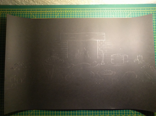

I then ingeniously stuck some Quality Street™ wrappers behind the fire, which instantly made the whole thing visually warmer, before attaching the whole thing to a sheet of acetate, which I rolled and stuck together in a cylinder.
Unfortunately, due to both time and money constraints, we were unable to find any lights which were good enough to project the images properly 😿. I suppose that’s something we should have sorted out a lot earlier on, but we live and we learn. Ash went and got some small wardrobe button lights from Clas Ohlson that were surprisingly bright. However, they were very blue, so they counteracted our intentions to make the place seem cosy and warm. That was disappointing, but it wasn’t terrible. We also had some LED candles flickering inside small paper houses that Ashleigh made, which served to create a nice image of inside vs. outside, especially including the paper trees (also made by ashleigh) and fake snow scattered around.
So that was basically it! Our work was done! The show was very much a success, and I was able to eavesdrop on a few positive remarks about our work (maybe they didn’t realise I could hear them from outside our little house). The piece itself sat quite comfortably in the room amongst the rest of the engineers’ fantastic work, and I think it even presented a welcome happy break within the exhibition, as it was all a little less wholly positive compared to ours (which isn’t a bad thing, by the way!).
As I said before, we worked rather well as a group, and I very much enjoyed the process. Each one of us took initiative along the way to do stuff and to help each other out. Yeah. Thumbs up.
Enough of that; here are the images: